An advertisement has a lot of components you need to think about: size, placement, the tone of voice, the logo, the photo, the offer and much more. It’s mind-boggling. And yet, most advertisements are created on nothing more than a gut feeling, with no scientific background whatsoever. And alas, the effectiveness of an advertisement is mostly measured on their overall click through ratio (CTR). Thus, we don’t really know which components of the advertisement are working well, and which ones need improvement.
Luckily there’s loads of research on how to set up an advertisement, which will maximize CTRs as well as branding potential. Nick Kolenda summarizes a lot of these design principles into one comprehensive blog, which is a must-read for every advertiser. In this blog, Kolenda reveals all the knowledge regarding ad characteristics, including the ad’s visuals.
Since people process visuals around 60.000 times faster – more or less – than text, this stresses the need for advertisers to be spot on in the visual department. In his blog, Kolenda describes that you need to depict products is such a way that it encourages mental interaction. Take this pen for example, this is what you would see just before you would pick it up (with your right hand, mostly).

‘Why?’ you may ask. When a product is being processed so swiftly, you want it to make the best immediate impression it can get. And by placing the product in a way people can picture themselves using it, it’s easier for the consumer to process it. This results in positive feelings that flow straight into the brand. Bingo! That’s the magic of processing fluency.
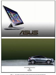
And that’s exactly what was found in the article from Leonhardt, Catlin and Pirouz (2015). By showing a side-view of a product inward toward the middle of the advertisement, you increase the processing fluency and the consumer evaluation.

Inward facing product (top) vs. outward facing product (bottom)
So How Can You Use This Knowledge In The Field?
The way you show, point and position a product’s picture has a surprisingly big effect on the feelings automatically evoked by an ad. But a quick peek in some random online and print ads shows us these principles are not yet widely understood among ad designers. So let me give you a few examples:


Here we see a perfect example from Apple, making their products face inward towards the center of the ad. On the right we see Dell’s advertisement facing outward towards the edge. Apple gets is. Dell doesn’t. The solution is clear: just flip it and let that processing fluency fulfill its brand-enhancing duty. Please note the difference in content by Apple and Dell as well; whereas Apple embraces a lean and mean look, Dell is filled with jibber-jabber, making it less easy to process.
Limitations
As always, there are exceptions to the rule. In the case of products facing center or border, it appears that the latter may be superior for specific brands that are inherently exciting, such as extreme sport brands, festivals and Hipster burger bars. In all other cases, I’d strongly advise to go with the flow of the brain by gravitating towards the center. Ads that allow the mind to relax are the ones that conquer the most mind share.